MAGAZINE PROMO ADVERTS
MARINA AND THE DIAMONDS - ELECTRA HEART

The album poster for Marina and the Diamonds' album Electra Heart features a mid shot of artist Marina Diamandis as her alter ego 'Electra Heart'. Her eyes are looking straight into the camera and her facial expression is soft, signifying a sense of innocence but at the same time shows her lack of vulnerability; however the audience may decode this in different ways and interpret her expression differently, which links to Stuart Hall's reception theory. Others may believe that she is looking into the camera to appear intimidating or seductive, as Diamandis describes this character as "a cold, ruthless character who wasn't vulnerable". An effect has been put over the photograph to make it look like it is an old film or it is being displayed on an vintage television, which makes it appear more retro. This theme is further reinforced by the white retro font of the text. Marina Diamandis' look is also made to look old fashioned, due to the curlers left in her hair and her makeup. This along with the beauty spot added make her resemble a darker Marilyn Monroe. However, Marina Diamandis' beauty spot is in the shape of a heart, which links to the album name and her alter ego 'Electra Heart'. This suggests that most of the music on the album is to do with relationships and love. This promo advert is likely to appeal to a young female audience, most of whom may aspire to look like her or identify with her style. The theme of this magazine advert reflects the genre of the music, as it is electropop. This again can be predicted by the album name 'Electra Heart'. The bottom of the advert says that the album includes 'Primadonna', which is the name of one of the songs in the album. This is included as 'Primadonna' is a successful single and is the most popular song from the album, therefore people who know this song and enjoy it would be interested in listening to the full album. The song name 'Primadonna' is taken from the noun 'prima donna', which is defined as "a very tempremental person with an inflated view of their own talent and importance". From this, the audience may interpret that Marina Diamandis, or her alter ego 'Electra Heart', is egotistical, vain and arrogant; which could also be suggested through her facial expression. Some people may not like the idea of this, and may decide to reject her and her music, which is mentioned in Richard Dyer's star theory. Others may also believe that this artist and her music may cause young females who aspire to be like her to also adopt this same attitude, which is known as the copycat theory. However, some may interpret her alter ego and the album as her trying to represent female archetypes, which she has mentioned before; therefore it is likely her fans, people that know about her and a more active audience will understand what message she was trying to convey and view it more positively, which is known as preferred reading.
RIHANNA - RATED R

This magazine promo advert is for singer/songwriter Rihanna's album 'Rated R'. It denotes a black and white image of Rihanna with one hand covering one of her eyes, and her visible eye is looking intensely into the camera. Her hair seems to be short and shaved at the sides, her makeup is dark, and she is wearing black; which gives off a gothic impression. This is likely to particularly shock members of the audience who are already aware of who Rihanna is, as her previous albums Music of the Sun and A Girl Like Me and style gave off a very different, feminine, Caribbean influenced image of her. However, people may have also expected this as her album just before was named 'Good Girl Gone Bad', signifying that she is going for a more mature image. Linking to Stuart Hall's decoding theory, an audience who has a preferred understanding will see that she is trying to break away from her good girl image; they would accept this and look forward to hearing her new album as they appreciate that she is experimenting with different styles. A negotiated audience may understand and accept Rihanna's new style, but may not fully personally agree with this change. An oppositional audience will see what she is trying to do, but may see her as a sellout as it seems as if she has ditched her Barbadian roots and is now becoming like 'any other pop artist' who sells music by looking and sounding 'provocative'. The photograph of Rihanna is made to look as if it has been ripped from somewhere else, which also adds to the edginess of the advert altogether. Two popular singles from the album, 'Russian Roulette' and 'Hard' are featured on the poster, which is for people who recognise these as they may be interested in hearing more of Rihanna's new sound. These titles are in red, this colour connotes danger which can also be suggested by the song titles themselves. The album title 'Rated R' along with the 'parental advisory' warning gives the audience the impression that the album's content is explicit, therefore it is aimed at a more mature audience; while her old music was more suitable for people of all ages to enjoy. This promo poster may also create enigmas, as readers may wonder what her musical genre is now, and whether has changed completely as the poster suggests something darker and more punk.
ELLIE GOULDING - LIGHTS

The promo advert for Lights by singer/songwriter Ellie Goulding features a picture of her looking to the left, as the reader looks down the picture gets darker and darker until it is completely black at the bottom, making the text easy to read. Ellie Goulding looking away from the camera suggests that she is deep in thought, or she is focused on something else that has taken her interest; it could also connote that she feels vulnerable, which gives readers the impression that listening to the album will reveal her deepest thoughts and feelings. This means that it is likely to appeal more to females who can identify with her and relate to her music. It is clear that the theme of this album poster is gold, as her name and the album name are in bright gold, and the photo has been edited in a way that makes it look like there is gold dust in her hair. This links to the album name 'Lights' and is likely to attract readers to it. At the bottom of the poster are short quotes taken from reviews of the album such as Q magazine, along with their rating in stars. These comments are all positive, which promotes the album further as the audience will think that since the album has positive reviews from professionals, it is worth listening to. The singles from this album are included at the bottom, so that readers who have heard these songs somewhere such as on the radio will have an interest in listening to the rest of the album. The song title 'Starry Eyed' also links to the album name and the gold theme. There is no date of release on the poster, which suggests that the album has already been released and is available for the audience to access.
more poster examples

|

|

|

|
I have noticed that many album promo posters are quite simple, they do not need to have a lot of text on them to be effective. They usually have a photograph of the artist that is related to the album itself, and the font used is the same font used on the album itself. They usually include the artist's name, the name of the album and when the song/album will be available. They also sometimes include the name(s) of the single(s) in the album, especially if they are popular as the audience would most likely know the songs and want to hear more.
magazine promo poster designs

|
This design shows a photograph of the side profile of the artist, with her eyes closed to suggest vulnerability. I thought that I should use a similar font to the one used in the digipak to make them link, however I also thought having 'little things' in a font that looked as though it was handwritten would give the audience the impression that the album is more personal. However, I then thought that if I really wanted the digipak and poster to link the photograph of Huldah should show her as confident rather than vulnerable.
The next two designs I drew show the artist as more confident, which is what I was aiming for. I did two similar designs but moved the text around and changed the sizing of it; I also drew two different pictures, one in the centre and one to the right to follow the rule of thirds. |

|

|
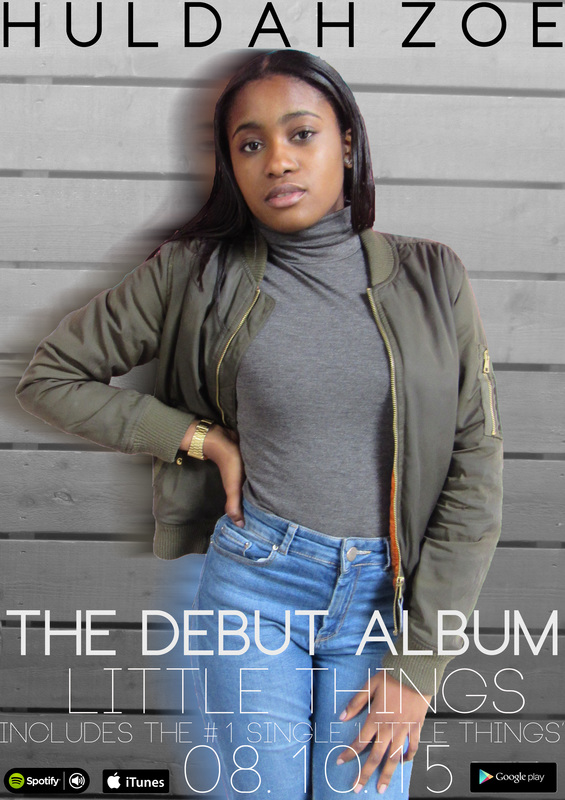
I am planning for my promo poster to effectively link to the digipak I created. I will do this by matching the colour scheme to the one of the digipak, this will be done by making the background black and white. I will also use the same font (Neou) and similar fonts to the one that I used in the digipak.
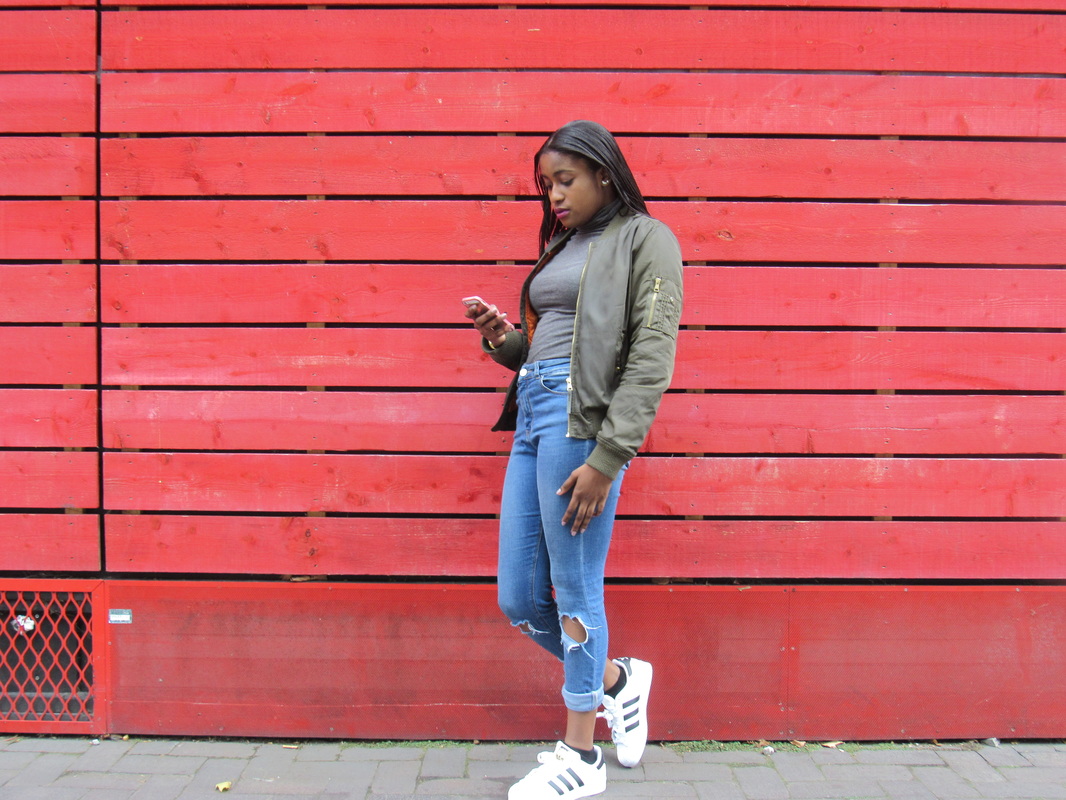
I decided to use the red background, make it black and white and zoom in on it, then paste a photograph of Huldah that was taken in front of another background on top of the background instead of just using the same photograph.
I decided to use the red background, make it black and white and zoom in on it, then paste a photograph of Huldah that was taken in front of another background on top of the background instead of just using the same photograph.


|

|
After my first try at making a poster and receiving feedback, I decided to space out "Huldah Zoe" as the first name is longer than the second, meaning it looks uneven at the top. I also decided that I would use the same font throughout for consistency and keep it black and white only, to make it look more simple and clean like the digipak. I also decided to change the photograph of Huldah to one that is more clearer.
Original photograph:
Original photograph:


I decided that I should add the name of the album's single, as it is common for this to be on an album's promotional poster. This helps the audience to identify the style of the album, and they are likely to take an interest in the album if they like the single.

|
|
I then thought that I should outline the white text in black as some of it is hard to see, especially the part that is in front of the photo of Huldah. I also decided to add a slightly blurred effect behind Huldah as this was done on the back cover of my digipak, therefore it linked.

I am happy with my final promo poster as I believe it shows a link to the digipak through the use of the text, the image and the background. I am glad that I changed the image of the artist too as the image before did not have the best quality therefore the poster would not have looked as professional. I decided to keep it simple like the examples above as I feel as though simple posters such as these are effective and get the message across to audiences efficiently, as sometimes when there is too much on a poster people may feel put off stopping to read it.
feedback


|

|

|

|
